Hi there,
In our quest to avoid monotony and to provide a better UI experience, we've introduced a new theme for our product UIs.
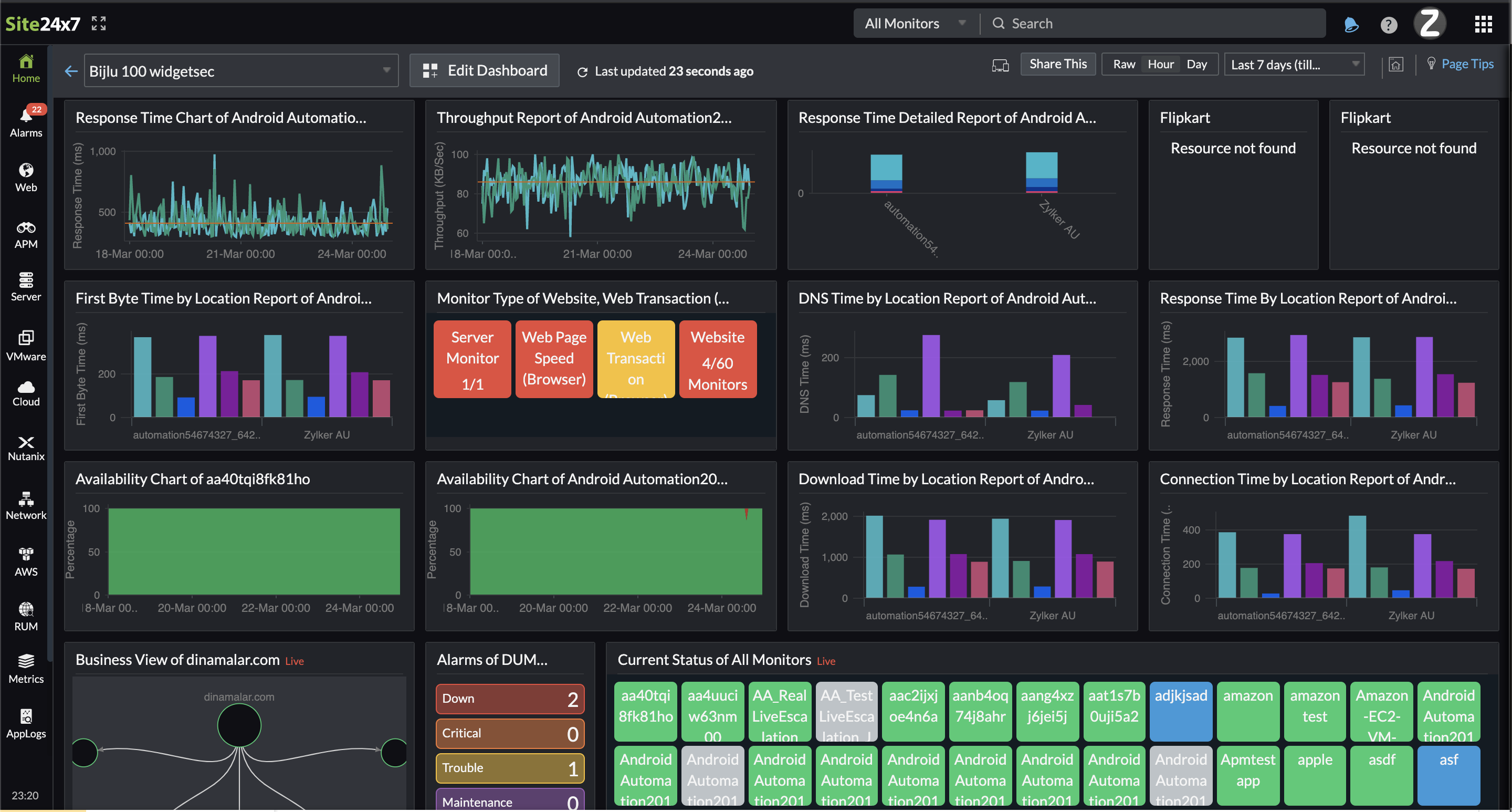
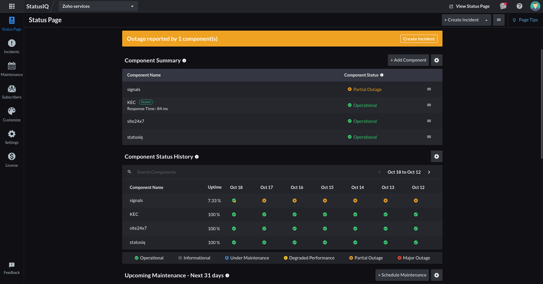
We're introducing a new dark theme for three products, Site24x7, StatusIQ, and CloudSpend. You'll experience a fresh look that provides improved viewability options, including greater contrast in the UI for your custom dashboards, Alarms tabs, as well as the Monitor Status, StatusIQ, and CloudSpend Budget or Account pages, and the overall web client.

How to enable the dark theme
You can activate the dark theme for your account by logging in to the Site24x7/ StatusIQ/CloudSpend web client, clicking on the Profile in the top right corner of the page, and toggling the Turn On Night Mode option.
Things to know
-
The dark theme presents data as light-colored text on darker backgrounds as it revamps colors, icons, and fonts in the product for an immersive, high-contrast display in the UI.
-
Each user in an account can enable the dark theme according to their preference.
-
We've updated the Profile section to feature a fuller pop-out layout that provides easy access to every personalization setting directly from within the web client.
StatusIQ
View your Component Summary, Component Status History, Incident Details, and more in the dark theme.

CloudSpend
View your Accounts, Budgets, Spend Analysis, and much more in the dark theme.
Here's an example of how certain sections of your Site24x7 client will look when the dark theme is enabled.
Monitor Status page

Besides the introduction of the dark theme, we have also worked on a slew of other updates around the client based on the feedback we'd received:
-
A more compact UI.
-
Better contrast in both light and dark themes for visual clarity of text within the client.
-
We have removed the icon to enable the dark theme in the custom dashboard and the network operations center (NOC) view.
The dark theme feature is live now. You can instantly start using it to visualize, troubleshoot, and explore your infrastructure in a different theme. Please try it out and share your feedback as comments below. We'd love to hear from you. Please let us know whether these features have improved your overall experience when you use our products. And let us know if you're enjoying the visual experience.
Happy monitoring!